


NOLA lagniappe: the letters, colors, and the streets
This first post is about the visual typographic treat of visiting New Orleans in spring 2024.

As a connoisseur of street lettering, hand-painted signs, and vinyl lettering found back home in India, when I first came to America, the lack of color and chaos was much missed in the orderly, uniform signages I found around me. The strip mall signages and homogenized single-color signs for multiple brands on a single building felt industrial, lacking the character or personalization that was inherent in Indian street signs. Occasionally, I spotted hand-painted and hand-lettered signs on storefronts or windows, and those stood out from the otherwise cookie-cutter lettering found elsewhere. For a while, I was obsessed with the New York subway mosaic signs for their sheer variety and intricacy. But when I visited New Orleans in the spring of 2024, it was for the first time I saw that variety, color, and character in signs around me that reflected the life, stories, and histories of a city.
NOLA and its Colonial past
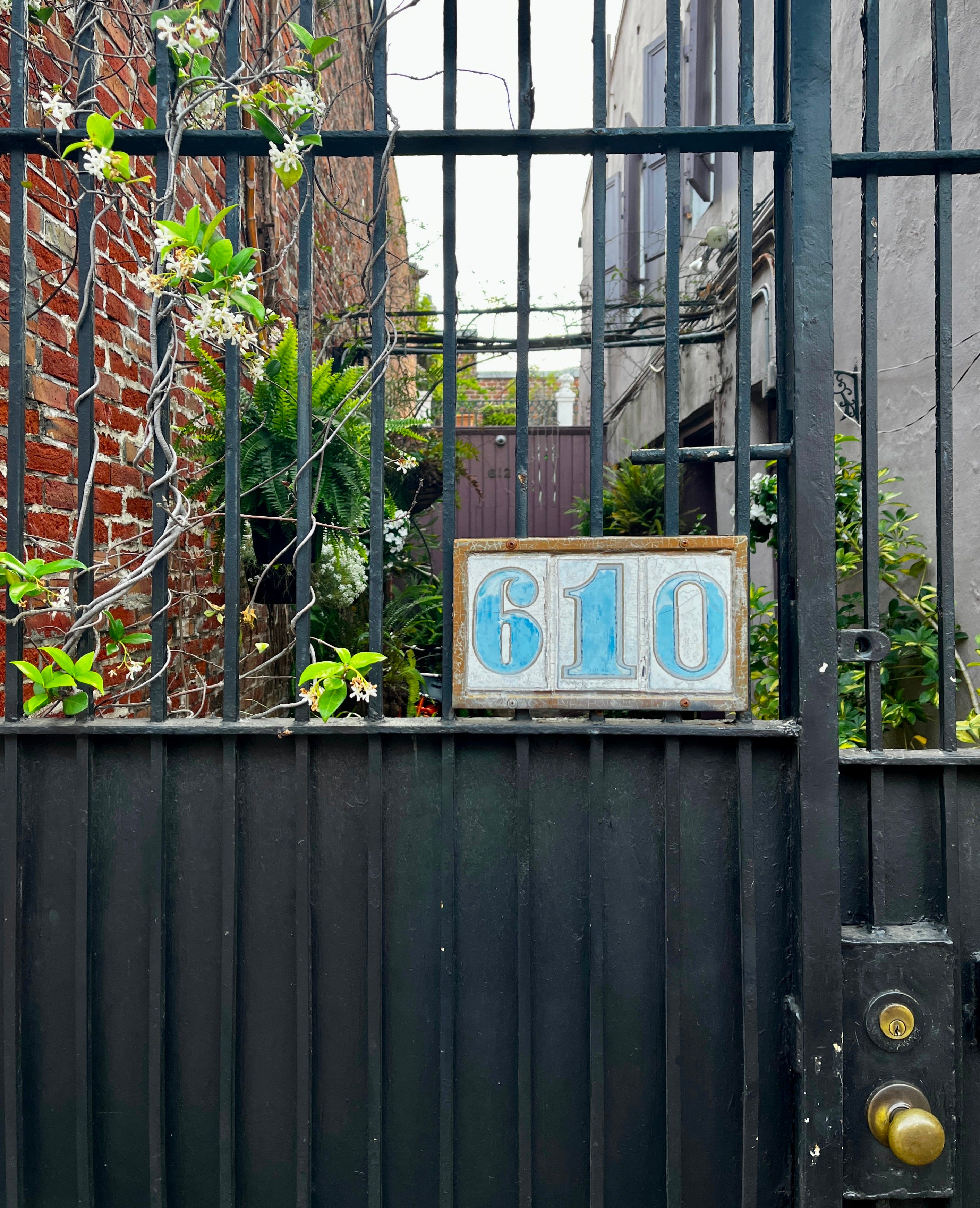
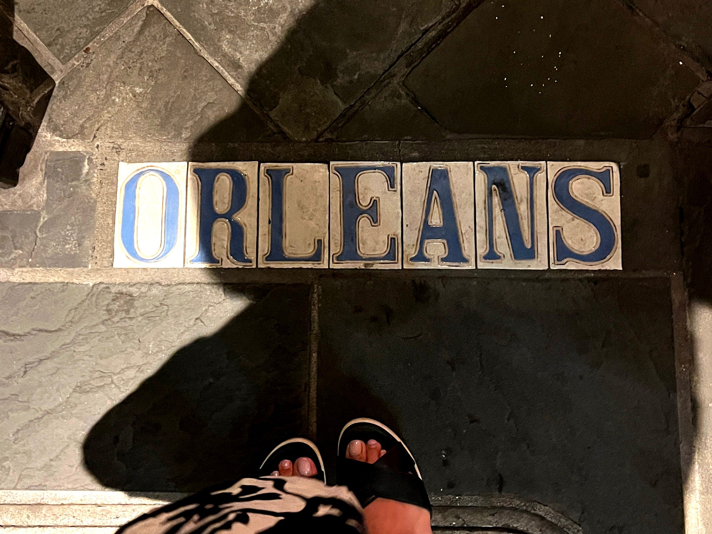
I found during my trip that Louisiana, being a French colony in the 1700s, was named after king Louis XIV. New Orleans was named after Philippe d’Orléans, the regent after Louis died, till Louis's grandson could come of age. Adrien de Pauger, a French engineer, designed the city's grid plan of 66 squares, which laid the foundation for modern New Orleans. French roots are apparent in French street names, the presence of the French Quarter, and the French market in NOLA. But the presence was felt beyond the surface in the tiled house numbers, blue street numbers, mosaic lettering on sidewalks, and art-nouveau-esq posters found on the street. The tiles of many numbered signs are almost comparable to street sign plates found in Paris. But the numbers themselves in New Orleans in structure are arguably not as petite or organic as the numbers found in Paris, and at this point is a mix of various material and lettering styles. Pictured here is a curious condensed bold, Clarendonesque glazed tile with 3 figures that appear to be from 3 different sets of weight and sizes. But it’s clear that you are in a contemporary urban neighborhood when you also find cast metal script figures and more industrial metal signs around the same vicinity.
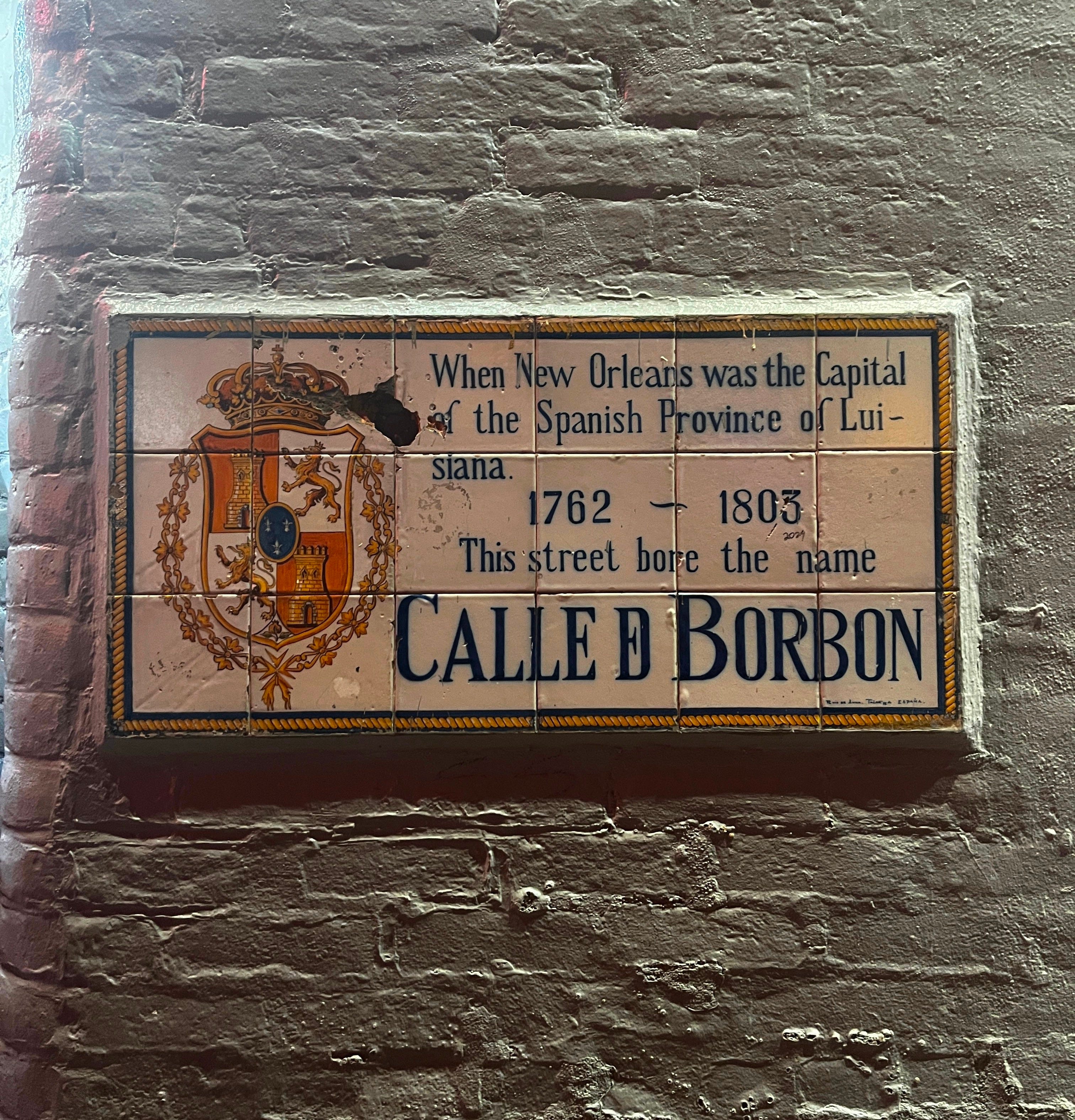
Two types of tiles stand out and cannot be placed in a French origin. The decorative tiles with floral borders and Roman figures, and the ‘Calle’ tiles, shed light into the history of France itself (French Revolution) and its effects on NOLA: Louisiana became a Spanish colony before the American Revolution and then an official American colony after the revolutionary war. So there you have your Spanish influence. This can explain the variety of the lettering style found in New Orleans.


The Creole, Haitian, Spanish, French, African, and American heritage, mixed with New Orleans's own evolution, perhaps gives it its current, vibrant, diverse lettering styles that seem French on the surface but are really a culmination of its colonial past, immigration, and evolution. According to NOLA website of tourism, Sicilians who transformed much of the lower French Quarter into “Little Palermo,” the Irish who built the New Basin canal important for New Orleans’ growth, to the Haitians who introduced Voodoo in the early 19th century, to the Vietnamese who arrived after the Vietnam War, all have contributed to the visual landscape of NOLA. The blue and white tiles that have now become the number one tourist souvenir from NOLA, were originally exported Belgium and Spain. A turbulent colonial history mixed with a surge of immigration gives NOLA its diverse culture, which in turn can be seen in its evolving lettering styles.
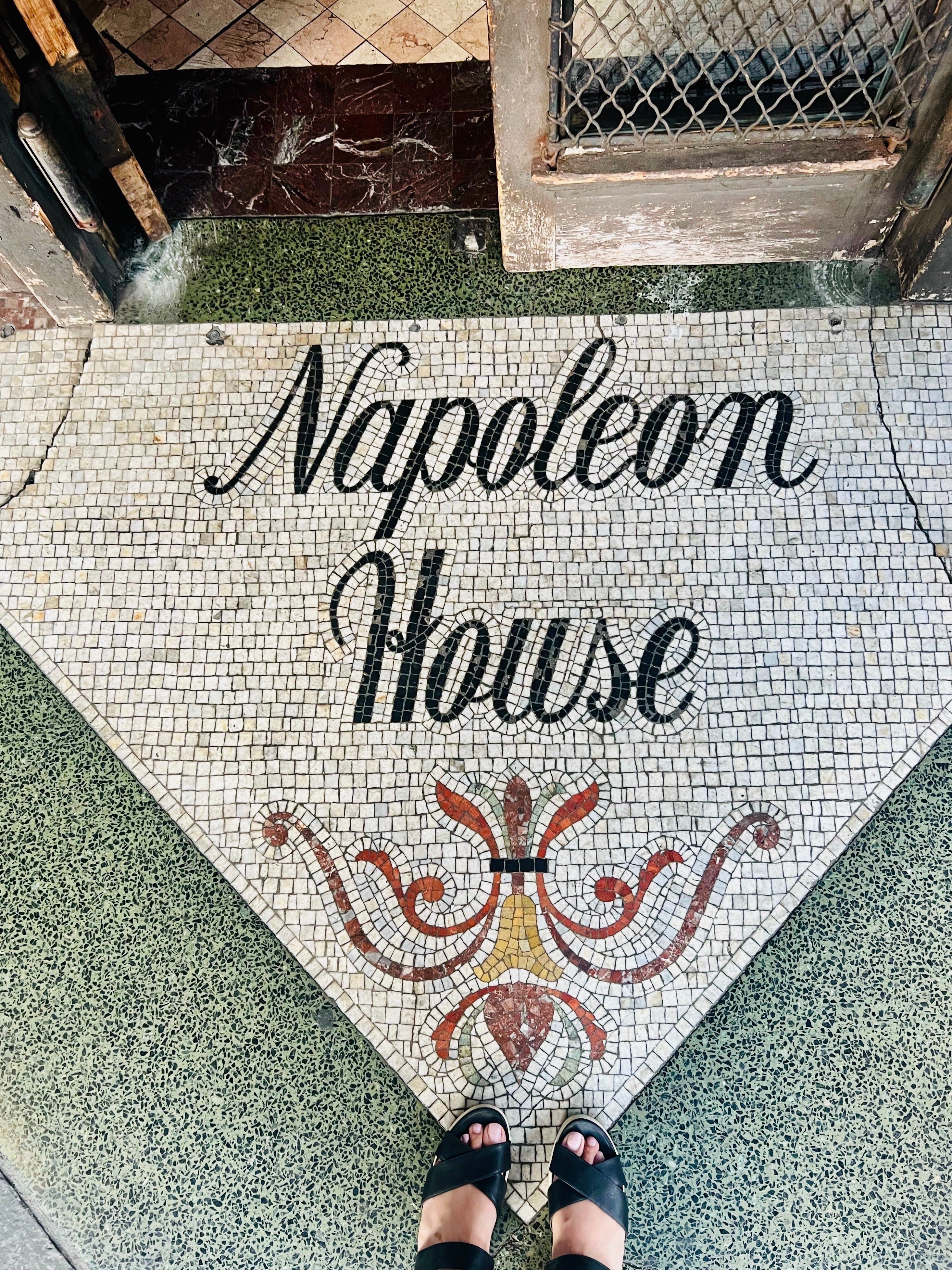
Architectural lettering
I found the letters in NOLA to be an ingrained part of the street or fascia. Lettering is constructed out of mosaic, and stone enamel, latticed on gates for doorways, and constructed as part of the storefronts. Phil Baines and Catherine Dixon argue in Signs, Lettering in the Environment, “As the signs (specific to streets) are required to be clearly identifiable in spite of the variety of backgrounds upon which they might appear and the varying surroundings, physical presence is an important design consideration. Therefore, the contouring and the use of materials such as vitreous stove enameling to make their presence felt no matter the degree of noise they might be in.” The physical presence of signs is definitely felt in NOLA. Given the tourist attraction in the French quarter of NOLA, the material used in making street signs makes sense. The tessellation and modularity of tiles give it a significant character and quite literally become part of the city's urban landscape. I can imagine this being adopted by bars and restaurants in the French district to create memorable signages out of tiles and mosaic so they would appear as a permanent fixture or perhaps a historic landmark.
Many business signs and Jazz bar signs also mimicked what looked like a middle ground between mosaic and Church stained windows. With a deep-rooted Catholic past with the Spanish stronghold, I wonder if these signs point towards that history. This felt like an attempt at urban areas maintaining a balance between being clearly classified as ‘Urban’ and conveying or evoking a historic presence through the markings and the kinds of signs around you.
Typography indeed intersects with architecture in NOLA. The hand-painted signs with beautiful compositions were different from the American hand-painting brush-lettered strokes, which I usually identify as trustworthy and solid. NOLA signs were more flamboyant, outlined, vibrant, and having a good time. The colors also match the bright colors, cool tiles, and pastel fronts found in the houses in the city. The houses were different from the wooden constructions I was used to seeing on the East Coast. The brightly painted exteriors in pastel colors, along with the front yards, tiled number signs, and the local flora, contributed to this distinction. The typography blended seamlessly with its surroundings.


For the Tourists
In the French district, with so many options for food and drink, businesses would want to feel the most New Orleans-y to ignite tourists and these signs support the authenticity or legitimacy of a place. The way the French district transformed into a colorful, chaotic party street with the onset of evening, even the chalkboards have to do the same. Each sign responds to its surroundings.
Jazz bars especially have letters with growing, anti-gravity structures like art nouveau forms. They have a certain streamlining in them which is reminiscent of art deco letterforms. Controlled organic geometry, tall, blooming, low contrast letterforms, but what stands out is the careful attention to the space around the letters and the overall layout itself.


The mix of lettering styles mentioned earlier also works for regulatory purposes, I believe. There are heritage markers for historic districts done in tile work, and mosaic street lettering. There are also pedestrian signs in metal. These signs create a clear distinction between the highly touristy areas and vs not. They clearly tell tourists to be aware of the history of the place they are in.
Lagniappe
The letters of New Orleans have become an urban fixture, narrating the city’s rich heritage. Bustling with history, the streets are filled with lettering inspiration. It shows what a melting pot of typographic cultures may look like. In the 1800s, many French artists were immigrants to Louisiana. Along with that, Creole immigrants also came from France. So despite the various historical influences, including Spanish and American rule, the city has preserved its strong French roots, leading to a uniquely NOLA French culture. Artist collectives and markets are possible because of tourism but also because of the diverse colony that it is today. An in-depth snapshot of the diversity of artists can be found in the many art markets. Many of these are clearly aimed at tourists, and you can see the Voodoo and Mardi Gras themes. But the homage to the city, architecture, and lively spirits, found even in these markets, felt Spanish, French, and Creole-inspired but Louisiana-grown. New Orleans remains a living canvas where history and culture converge to tell its ongoing story.
References and Further Reading
City of a Million Dreams: A History of New Orleans at Year 300, Jason Berry
Signs: Lettering in the environment, Phil Baines and Catherine Dixon
NOLA tourism website
Signage design manual, Edo Smitshuijzen
nola.com
Lagniappe is a Cajun French term meaning "a little something extra." My friend Khadija Aziz, who was raised in New Orleans, introduced me to this word on the trip.